In some cases, it is possible to use images of text for visualisation, for instance where a particular presentation of text is essential to provide the information, for instance type samples, logotypes, branding, charts, screenshots and diagrams, etc. Images of text may also be used in order to use a particular font that is either not widely deployed or which the author doesn’t have the right to redistribute (W3C, n.d.).
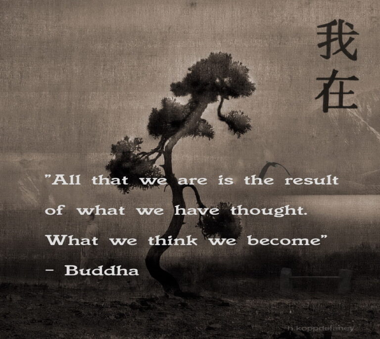
Below is an example of “images of text” and “common text”.
All that we are is the result of what we have thought. What we think we become.
Buddha

Tips
- It is advisable if an author can use text to achieve the same visual effect, s/he should present the information as text rather than using an image.
- If for the reasons mentioned above, the author cannot format the text to get the same effect, then an image of text can be used.
- When using images of text to achieve desired visual presentation, it is important to consider that some persons will need adaptations to be able to receive the information:
- text in a particular font size
- foreground and background colour
- font family
- line spacing or alignment to be able to receive the information from the image
(W3C, n.d.)
Source: W3C, n.d.: Understanding Success Criterion 1.4.5: Images of Text. https://www.w3.org/WAI/WCAG21/Understanding/images-of-text.html#dfn-image-of-text [1.9.2022].
